Monday, April 12, 2010

Logo Design - How to review packages?

Most of the time as a small business you might find yourself confused with the terms used on the websites of these affordable logo design companies. If you do not know exactly what these terms mean please ask them or you might waste your money on buying something you didn’t even need.

Logo design services providers on the web have some terminologies that you need to be familiar with in order to buy the right package to meet your needs.

Number of Concepts
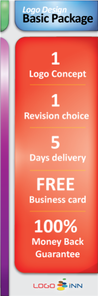
Different logo design companies provide different number of concepts with their packages and some even promise unlimited number of concepts. A concept is the main look, feel and structure of your logo design.


Number of Revisions
Some logo design companies provide you packages where you are offered unlimited revisions on a logo design. This means that you can send back a logo with your comments for a revision and the graphic designers at the company will try to improvise the logo. But please note that they will not provide you a new logo each time, instead they will stick to the one design and keep improving it.


Number of Designers
Freelancers usually work alone, but a logo design company usually has a team of graphic designers and some companies offer you different concepts from different designers to choose from. More designers mean that you will get to see two different outlooks on the logo.

Turnaround Time and Delivery Time:
There is difference between these two; since you might be needing revisions the turnaround time is when the logo design company sends you the first concepts or revisions for your feedback. Delivery time may vary depending on how much concepts and revisions you are going to get.

Even though your logo design company might offer you a 100% unique logo design, there is still a great chance that your logo might accidentally look similar to some other business or organization’s logo. What you need to know is that most logo design companies ask you to digitally sign an agreement where you agree that you will not demand for damages in case you get involved into trademark or copyright war.
Mostly this is just a precaution from your logo design company’s side. But, if it makes you uncomfortable then ask your logo design company to explain this further to you.

Thursday, April 8, 2010

Web Design and your Logo


Using your visual brand identity on your website is just as important as anything else. Small businesses often ignore the fact that the consistency in design increases the comfort level, makes it more easier, memorable and reminding. I have often seen websites where logo at the top of the web pages does not meet the rest of the website's theme it looks alien and not at all memorable.

The question is whether you need to get your logo designed to meet your web design needs? - OR - you should have your web design styled to match your logo design?

Logo design is used every where from print to web, to brochure and on coffee mugs. While your web design is only used on the web. So your logo design should be made to fit all those mediums. It is the best strategy to hire the same company or web designer to do your logo that way it will be much easier for them to maintain consistency between designs.

On your website, your logo is not going to be only image. You would probably be using flickr, twitter, facebook buttons as well. I have seen countless websites ruining their sidebars with many colorful buttons for countless social networking websites. Don't do that please, instead select a few popular social networks where you have some influence and get your buttons chromed to meet the color scheme of your web design.

Tuesday, April 6, 2010

Adobe Illustrator Tips and Tutorials for Logo Design Artists

Adobe Illustrator is the most commonly used vector graphic tool. We use it to create custom logo design for our clients. We are seriously thinking about starting a blog focused on using the Adobe Illustrators with tips and tutorials to do different things. Meanwhile we thought it would be a great idea to compile a list of websites publishing Adobe Illustrator tips and tutorials for newbies.

Adobe.com Illustrator Help and Support - Official Adobe Illustrator Support site has many tutorials, tips and video tutorials.

Adobe Illustrator Exchange is a place where you can share your illustrator graphics with the community and see other's work for inspiration and learning.

DesktopPublishing.com's Adobe Illustrator Tips and Tutorials page. It contains links to many tutorials from across the web, making it a good starting point for someone who is already a little familiar with Illustrator.

Illustrator Tips, Instructions Information Inspiration is their motto.

Adobe Illustrator Tutorials. We really liked their Basics & Tools category which contains articles specifically for beginners.

Smashing Magazine: Illustrator Tutorials, Smashing magazine has some very good tutorials too.

Make Banner Design Effective Marketing Tool

Banner graphics are still the largest most popular format of online advertisement. But years ago advertisers and marketers came to a conclusion that the wide usage of common formats of online banner design has made the audiences banner blind. What does it mean? To simply put people have now decided to ignore the online banner advertisements.

Recently it was also discovered that banner designs can be the most annoying form of web advertisements after pop ups and pop-unders. However, many advertisers still report that the banners are still there most effective tool.

First of all not all banner designs are annoying. Each day we often come across various informative, suggestive, thought provoking, interesting and brilliant banner designs. They key that small businesses, advertisers and marketers need to understand that in order to be effective their banner design needs to be less annoying and more web friendly or I would say more audience friendly.

Lets first understand the anatomy of a horrible banner design; this design is noisy, offensive, unintelligent, dumb and very boring. This particular banner design has the ability to make me hate the websites that display it and make me use plugins to block all the advertisements. This is a banner design that disturbs me with its fast moving animations and shocking bright, eye teasing colors. This annoying banner design makes false promises and fraudulently invites me to click it by displaying deceptive images.

To make a banner design a really effective marketing tool we need to remove all the elements that make our banner design annoying and instead we should add elements that would make our banner design more clickable and likable.

Colors, using colors that do not hurt the eyes of the viewer is something that cannot be stressed more. Please stop using red font on a yellow background. It really hurts the eyes, looks ugly and ruins the design of any web page hosting and displaying this hideous banner design.

Animations, it is wonderful to know that an advertiser paid extra money to get an animated banner design. Even though most designers would tell you that faster animations make a banner less clickable. But businesses believe that the designers are avoiding extra work, hence they insist on more animation. Please note that a banner that animates too fast not only looks ugly but it also slowdowns a viewer’s machine. Use simple animations that are not too fast and not too distracting.

Fraudulent banners are the most offensive ones. These are the banner designs that pretend to look like an operating system menu and warning the user about some potential threat or an announcement that they have won something. There are even banners that offer people instant wealth, fame and glory. We all wish the world was that easier, and we all know that it is not. So please stop making a fool of yourself no one is actually going to click on such a banner with an intention of becoming a customer.
Related Posts with Thumbnails